
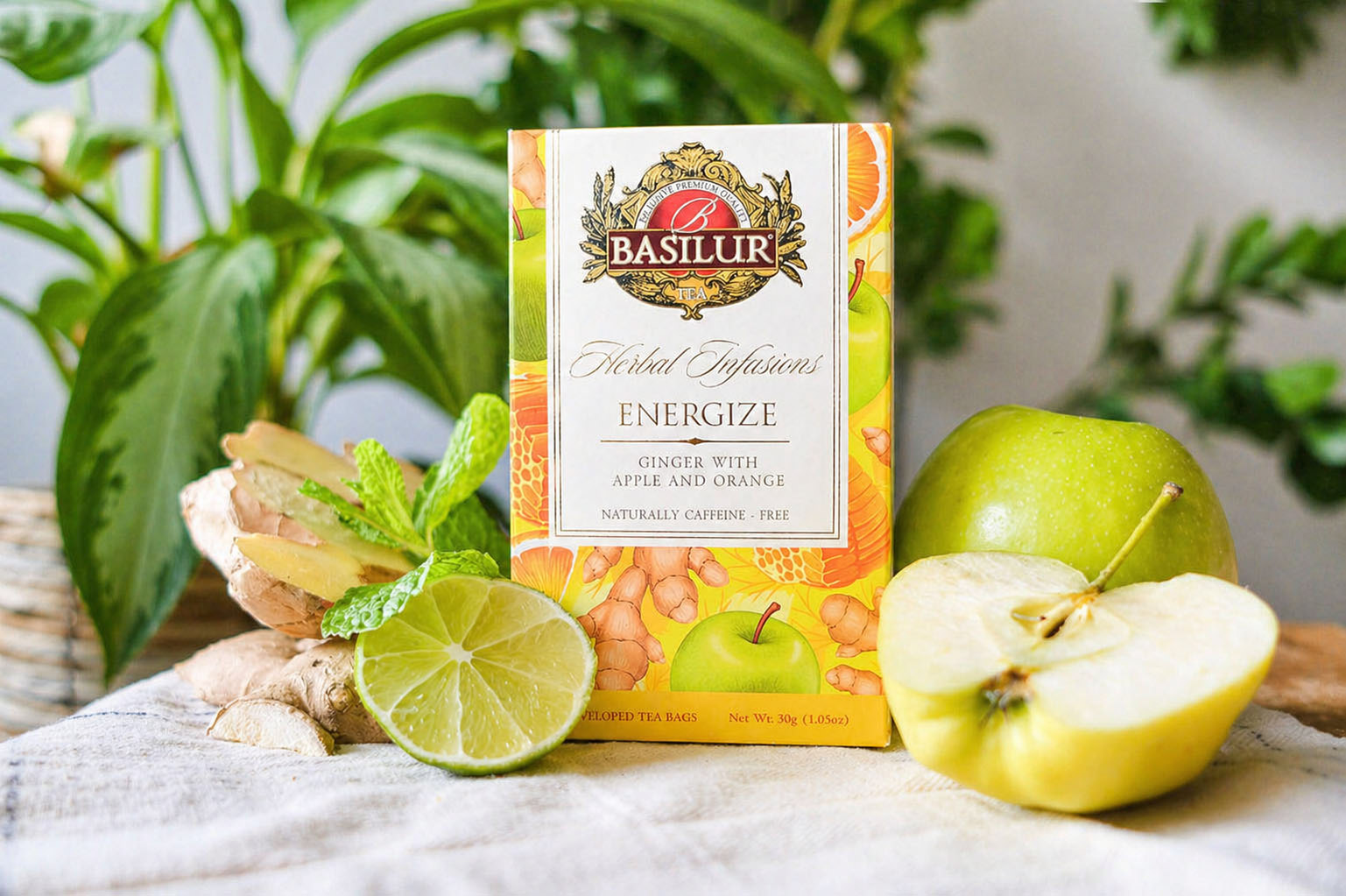
Basilur Herbal Infusions — Packaging System
A refreshed visual identity for a cohesive product range
Redesign of the full Herbal Infusions range, built as a cohesive packaging system.
The updated visual language balances the brand’s heritage with fresh botanical
illustration, improving clarity and differentiation across the line.
Role — Packaging design, illustration, full range redesign

Design Approach
The packaging system is built on a clear and scalable structure, combining a refined central layout with expressive botanical illustrations.
Each flavor is defined through its own color palette and ingredient-driven composition, allowing the designs to feel distinct while remaining visually cohesive across the range.
The balance between clean branding elements and rich, hand-drawn artwork creates a premium yet approachable look, improving both shelf impact and product clarity.
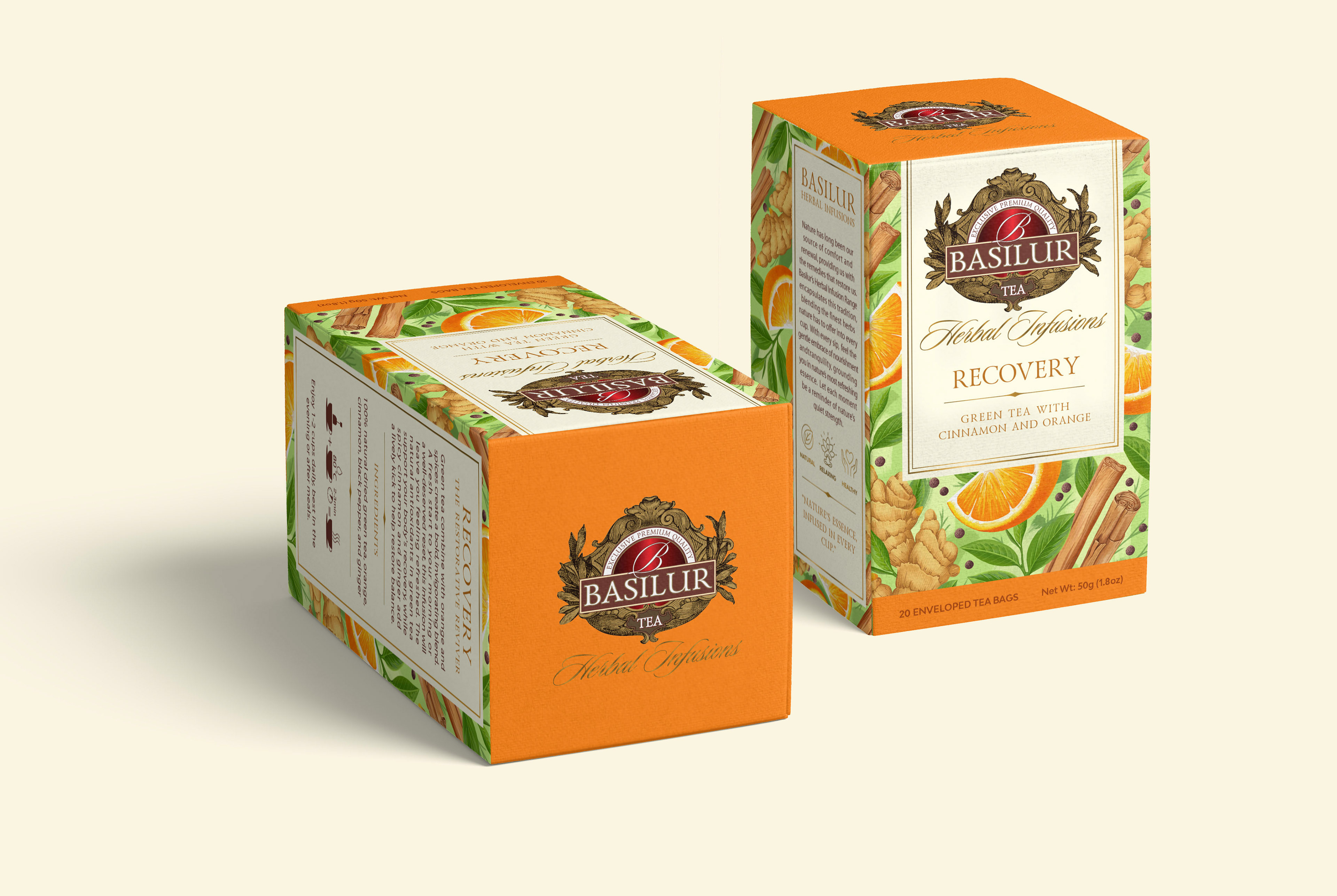

Visual System
Each flavor is defined by a distinct botanical composition. Color palettes and ingredients create clear differentiation, helping customers easily navigate the range.

Botanical Illustrations
Crafted exclusively for the Basilur Herbal Infusions range
Each illustration was created from scratch to reflect the character of its blend — the ingredients, the mood, and the moment of drinking. The artwork is designed to work both as a packaging element and as a standalone visual, giving each flavour a distinct identity that goes beyond the label.


Information Design
The layout balances rich illustration with clear information hierarchy. Key details remain easy to read while preserving a premium, handcrafted feel.
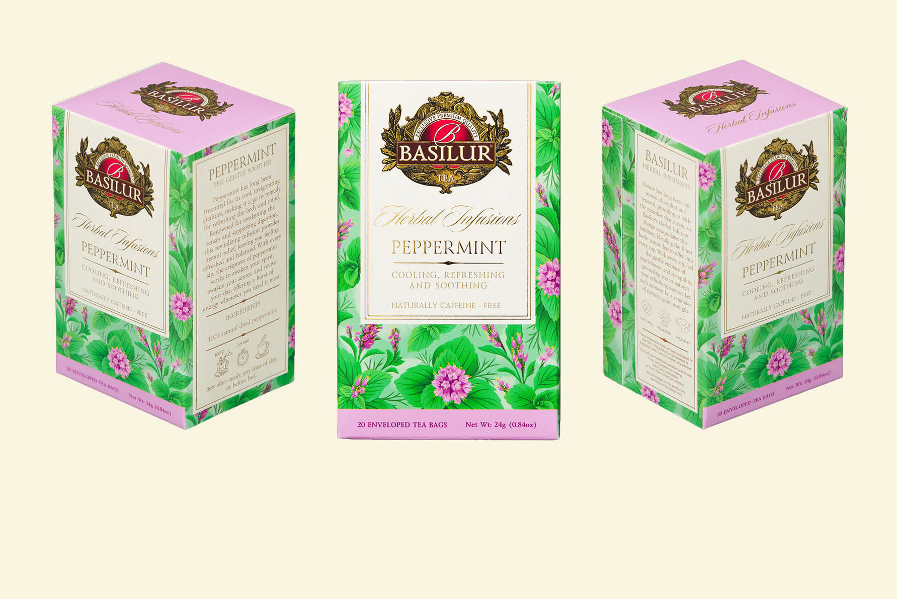

The result
A cohesive and scalable visual system that brings clarity, character, and consistency to the Basilur Herbal Infusions range.
The redesign strengthens shelf presence while allowing each flavor to stand out through its own visual story.


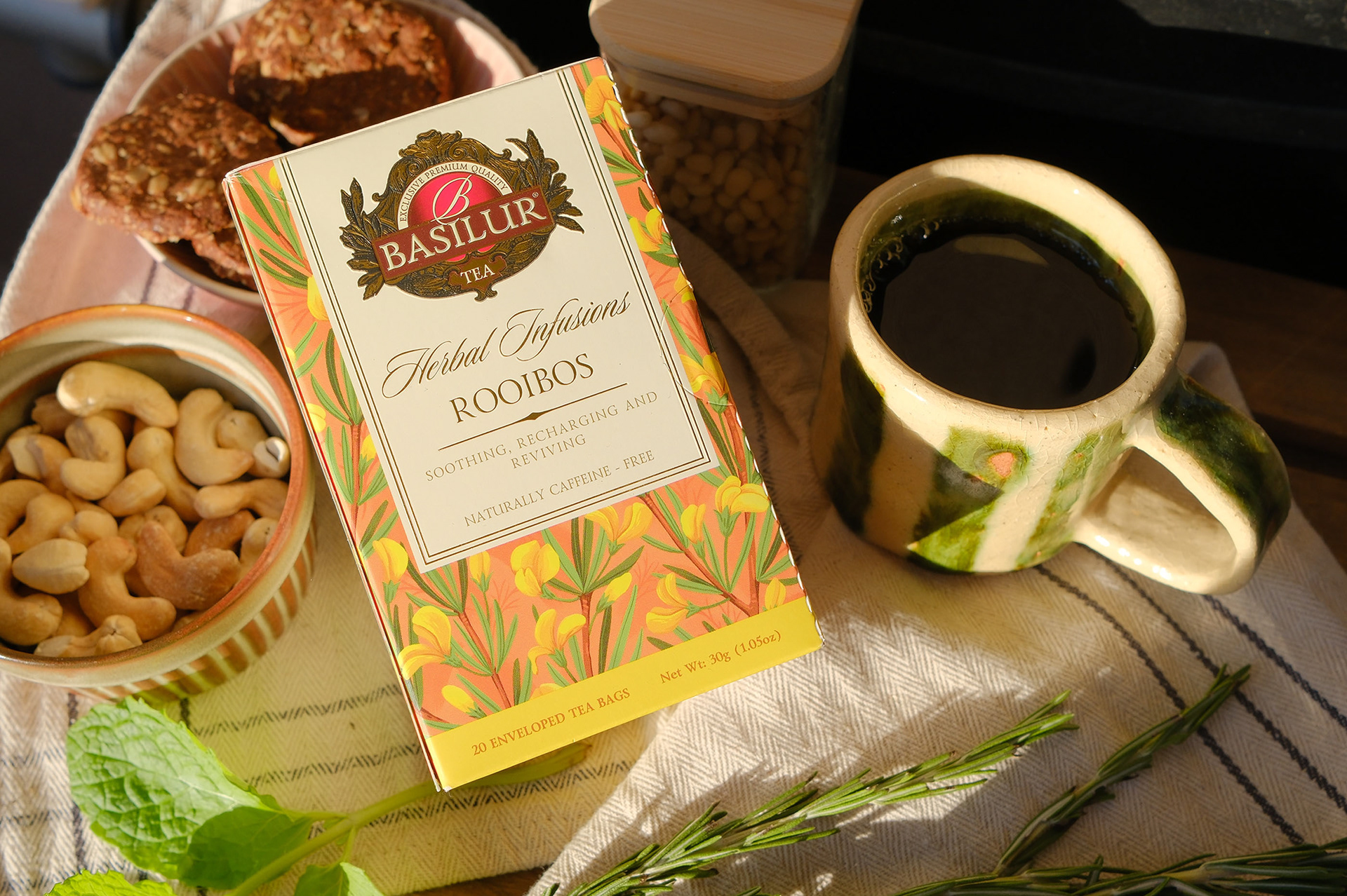


Crafted with botanical illustration, thoughtful color systems,
and a love for tactile packaging design.
and a love for tactile packaging design.
Mona Monash